This is my fourth post, following along with Dr. Greger’s presentation of his book: “How Not to Age.” The following 14 minutes, starting at 42:46, covers Part III: Preserving Function of the book. The chapters are about how to preserve the body’s function: bones, bowel and bladder function, circulation, hair, hearing, hormones, immune system, joints, mind, muscles, sex life, skin, teeth, vision, and last but not least, dignity and death.
I’m only covering two minutes of the section on Bone Health in this post; however, I spent two hours studying these two minutes. There’s much to learn. Since I received my book copy yesterday, I will read and listen to this chapter. Meanwhile, here’s what I learned from the presentation; any errors are mine.
In fact, BMD [Bone mineral density] is only a modest risk factor for fractures; about 85% of the contribution to the fracture risk in general, or to the rise in fracture risk with age, is unrelated to BMD.[70]
Fractures are primarily due to falling, not osteoporosis. Despite a wide consensus that fractures in adults are ‘osteoporotic’, evidence indisputably shows that both hip and vertebral fractures are predominantly traumatic (caused by an injury). …. It is most likely that the ageing-related muscle loss and reduced balance contribute to fracture risk through increased propensity to falling. This could, at least partly, explain the relatively poor predictive value of bone loss in identifying those at risk of sustaining fractures in old age. [71]
The results of meta-analysis of seven studies showed that physical exercise had significant effect on fracture prevention (RR = 0.54, 95% CI, 0.35–0.83; I2 = 25%, p = 0.005).[72]
COMB [ combined resistance and balance-jumping training] group had 51% less injurious falls (RR 0.49, 95% CI 0.25 to 0.98) and 74% less fractures (RR 0.26, 95% CI 0.07 to 0.97)[73]
Osteoporosis drugs can cause fractures
Known as atypical femur fractures, these breaks occur not after a fall or other trauma, but during routine activities, like walking, twisting at the waist, or even just standing still. The injuries are devastating, Miller says, often requiring multiple surgeries, a stay at a rehabilitation facility, and months to walk normally again.
However, existing real-life data do not support clear clinically relevant antifracture (including hip fracture) effects of bisphosphonates[74] [Fossamax is one example[75]] or any other compounds ….. 11 atypical femoral fractures per year amongst 10 000 users of bisphosphonates. One atypical femoral fracture will occur for about 300 patients treated for 3 years.[71]
Known as atypical femur fractures, these breaks occur not after a fall or other trauma, but during routine activities, like walking, twisting at the waist, or even just standing still. The injuries are devastating, Miller says, often requiring multiple surgeries, a stay at a rehabilitation facility, and months to walk normally again. Worse yet, many atypical femur fractures can feel like a too-cruel joke to patients because they aren’t directly caused by bone disease. Rather, they may be an adverse effect of bisphosphonates – the very medications that treat osteoporosis.[76]
References
[70] Sievänen H, Kannus P, Järvinen TL. Bone quality: an empty term. PLoS Med. 2007 Mar;4(3):e27. doi: 10.1371/journal.pmed.0040027. PMID: 17341126; PMCID: PMC1808066. https://www.ncbi.nlm.nih.gov/pmc/articles/PMC1808066 Not listed in in How Not to Age Citations
[71] Järvinen TL, Michaëlsson K, Aspenberg P, Sievänen H. Osteoporosis: the emperor has no clothes. J Intern Med. 2015 Jun;277(6):662-73. doi: 10.1111/joim.12366. PMID: 25809279; PMCID: PMC4497616.https://www.ncbi.nlm.nih.gov/pmc/articles/PMC4497616/ Cited as 3270, 3275, 3277, and 3293 in How Not to Age Citations
[72]
Wong RMY, Chong KC, Law SW, Ho WT, Li J, Chui CS, Chow SKH, Cheung WH. The effectiveness of exercises on fall and fracture prevention amongst community elderlies: A systematic review and meta-analysis. J Orthop Translat. 2020 Jun 1;24:58-65. doi: 10.1016/j.jot.2020.05.007. PMID: 32695605; PMCID: PMC7349939. https://pubmed.ncbi.nlm.nih.gov/32695605/
Cited as 3283 in How Not to Age Citations
It’s worth noting that there is more to this conclusion – the results apply to women but not both genders: However, the effect was significant when exercise intervention applied to women participants only (RR = 0.37, 95% CI, 0.20–0.67; I2 = 0%, p = 0.001) but not significant when exercise intervention applied to both genders (RR = 0.80, 95% CI, 0.58–1.09; I2 = 0%, p = 0.15). …. The effectiveness of exercise interventions on fracture prevention have more significant effect on women. Further studies are needed to test the effectiveness of exercise interventions in men.
[73] Karinkanta S, Kannus P, Uusi-Rasi K, Heinonen A, Sievänen H. Combined resistance and balance-jumping exercise reduces older women’s injurious falls and fractures: 5-year follow-up study. Age Ageing. 2015 Sep;44(5):784-9. doi: 10.1093/ageing/afv064. Epub 2015 May 18. PMID: 25990940.https://academic.oup.com/ageing/article/44/5/784/51854 Cited as 3285 in How Not to Age Citations
[74] Bisphosphonates define a class of drugs widely indicated since the 1990s to treat osteoporosis both in men and women. Their effectiveness in treating osteoporosis and other conditions is related to their ability to inhibit bone resorption. ….
Adverse Effects [the full list of 7 adverse effects are worth studying]
Atypical Femur Fractures Another rare but serious adverse effect of bisphosphonates is an atypical femoral fracture, typically involving diaphysis or sub-trochanteric region of the femur. Over suppression of bone turnover, pathophysiological alteration in the bone quality, and impairment of fracture repair process, or thought to be responsible for these atypical femur fractures, which are considered stress fractures. The incidence is 3.2 to 50 cases per 100,000 person-years, and the risk increases with the duration of exposure to bisphosphonates. Atypical femur fractures are usually not seen within the first five years of bisphosphonate treatment, with most cases reported with more than seven years of bisphosphonate treatment. Initial symptoms are dull aching pain in the groin. Plain X-rays may reveal cortical thickening. Findings of radiographs, especially if early/mild, shall be confirmed by further imaging with magnetic resonance imaging (MRI) or bone scintigraphy. Bisphosphonates shall be discontinued in patients who suffer an atypical femur fracture in one leg; if the drug is not stopped, these patients are at higher risk of developing atypical femur fracture in the other leg. Discontinuation of bisphosphonate is associated with a decline in this risk. A drug holiday shall be considered after prolonged exposure to bisphosphonates when clinically appropriate.
Source Ganesan K, Goyal A, Roane D. Bisphosphonate. [Updated 2023 Jul 3]. In: StatPearls [Internet]. Treasure Island (FL): StatPearls Publishing; 2023 Jan-. Available from: https://www.ncbi.nlm.nih.gov/books/NBK470248/#article-18343.s5 accessed 6 December 202
[75] Bisphosphonates are usually the first choice for osteoporosis treatment. These include:
Alendronate (Fosamax), a weekly pill
Risedronate (Actonel), a weekly or monthly pill
Ibandronate (Boniva), a monthly pill or quarterly intravenous (IV) infusion
Zoledronic acid (Reclast), an annual IV infusion
Another common osteoporosis medication is denosumab (Prolia, Xgeva).
[76] Abbasi J. Amid Osteoporosis Treatment Crisis, Experts Suggest Addressing Patients’ Bisphosphonate Concerns. JAMA. 2018 Jun 26;319(24):2464-2466. doi: 10.1001/jama.2018.7097. PMID: 29874373. Behind paywall. Not listed in in How Not to Age Citations
This is the third post I’m writing on Dr. Greger’s presentation that kicks off his new book: How Not to Age. In this post, I will do a deep dive into three sections: Making meat safer – cooking methods, Eating fish, and Drinking alcohol. These sections of the video are summaries of three areas covered in Part II: Optimal Anti-Aging Regimen of How Not to Age. Again, any errors in the post are my mistakes; let me know and I will make corrections.
“WFPB [Whole-Food Plant-Based] diet has been shown to reduce the amount of gerontotoxins measured in the blood….”[46]
Gerontotoxins. [47] Gerontotoxins, a contributor of systemic inflammation, are a group of toxins that cause our cells to age. A well-studied toxin is an advanced glycation end-product (AGE)
Exogenous formation of AGEs
AGEs are naturally occurring chemicals in raw animal-origin foods, and cooking propagates and accelerates the generation of more AGEs within them. Studies have shown that dry heating results in the formation of more than ten to hundred times of new AGEs in foods as compared to the uncooked state. [48]
The reason for this high AGE content in red meats and poultry is probably given by the fact that, when cooked under dry heat, these release high amounts of highly reactive amino-lipids and reducing sugars, like fructose or glucose-6-phosphate, due to the rupture of lean muscle cells. [49]
cooking methods can play a critical role in regulating the levels of AGE formation, with effects ranging from those caused by oven-frying > frying > broiling > roasting > boiling/poaching/stewing/steaming. For example, cooking meat (e.g., chicken, pork, or beef) by boiling or stewing can reduce the AGE contents to one-half of that prepared by broiling.[50]
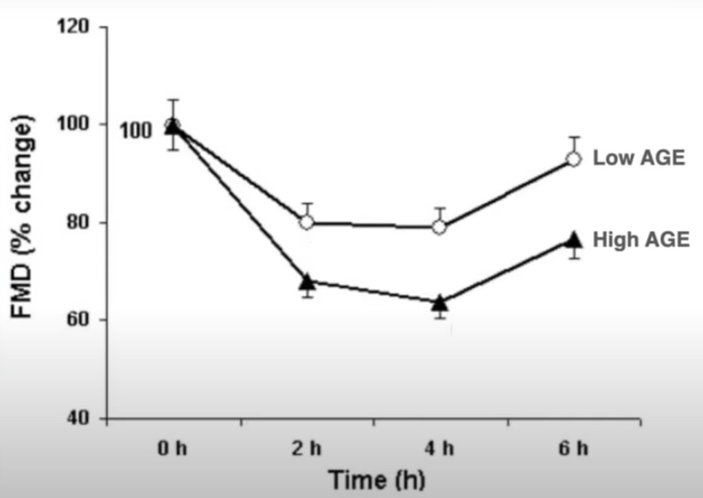
HAGE [high-AGE] and LAGE [low-AGE] meals It showed that a single “real-life” HAGE meal induces a profound impairment of both macro- and microvascular function (−36.2% and −67.2%, respectively). These changes are significantly greater than those induced by a meal containing the same ingredients but with a five-fold lower AGE concentration (LAGE meal).[51]
Change in Macrocirculation (flow-mediated vasodilatation) for Low AGE and high AGE meals versus time, this figure is an adaptation of Figure 1 of [51]
The AGE Less diet is the name given to diet with reduced AGEs. The AGE Less diet involves no caloric restriction and no medication. It involves avoiding the very worst foods (fried bacon) a reduction in very high AGE foods and cooking with moist heat instead of dry heat.
Although the science of AGEs is very well documented with over 8000 papers listed in PubMed, it is little known to both health care professionals and the general public. In an important regard, the science of AGEs shares a common characteristic with rapamycin; both have zero commercial value.[52]
Ocean pollution is a complex mixture of plastic waste, toxic metals, manufactured chemicals, oil spills, urban and industrial wastes, pesticides, fertilizers, pharmaceutical chemicals, agricultural runoff, and sewage….. Consumption of contaminated seafood is the main route of human exposure to chemical pollutants, HAB toxins, and plastic microparticles and microfibers in the oceans.[54]
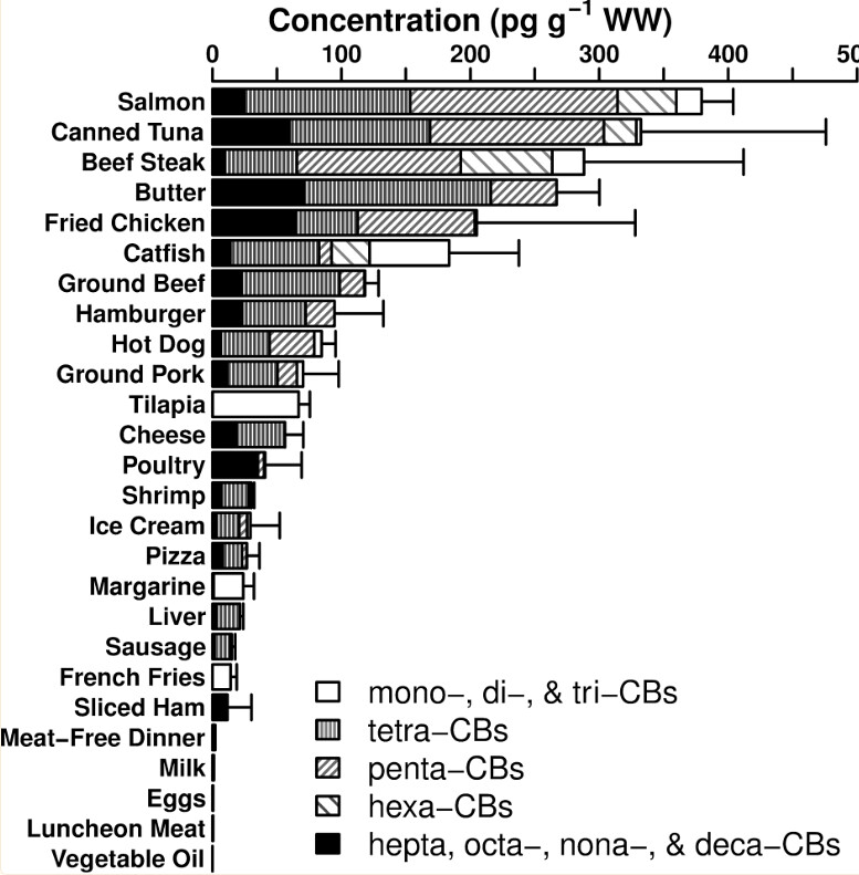
PCB concentrations in foods [55]
Fish, especially fatty fish, have long been viewed as a healthy dietary component because of their unique content of long-chain n-3 PUFA (n-3 fatty acids). …. On the other hand, fish may also contain diverse environmental pollutants such as heavy metals and persistent organic pollutants (POP), including organochlorine pesticides, polychlorinated biphenyls (PCB), dioxins, polybrominated diphenylether (PBDE) and perfluorinated compounds (PFCO).[56]
Considering the accepted benefits of omega-3 fatty acids, failure to consistently observe beneficial effects of fish consumption may even be regarded as indirect evidence of harmfulness of contaminants in fish.[57]
The resulting loss of intelligence causes diminished economic productivity that persists over the entire lifetime of these children. This lost productivity is the major cost of methyl mercury toxicity, and it amounts to $8.7 billion annually…[58]
Mercury toxicity may be associated with cognitive decline diagnosed as Alzheimer’s disease.[59]
Globally, alcohol use was ranked as the seventh leading risk factor for premature death and disability in 2016… Our results show that the safest level of drinking is none.[60]
The sick quitter skews results …. the misclassification of former and occasional drinkers as abstainers is virtually the norm in alcohol epidemiology. …. individuals with poorer health are more likely to cut down or stop drinking completely. Such individuals are often still classified as ‘abstainers’ and used as a reference against which all current drinkers are compared. In simple terms, they make drinkers at all levels of consumption ‘look good’ by comparison.[61]
Estimates of mortality risk from alcohol are significantly altered by study design and characteristics. Meta-analyses adjusting for these factors find that low-volume alcohol consumption has no net mortality benefit compared with lifetime abstention or occasional drinking.[62]
The more alcohol, the more disease with no apparent protection at low levels of consumption.
Tea consumption reduces mortality Dose-response analysis showed that an increment in tea consumption by three cups per day was related to a 24% reduction in total mortality (0.76, 0.63-0.91). Consumption of green tea and black tea were both associated with reduced total mortality, and an increase of one cup of green tea or black tea per day could reduce the risk of total mortality by 4% or 3%, respectively.[66]
Green tea may help prevent flu Although several studies have reported that green tea catechins (GTCs) might prevent influenza virus infection, …. In a random-effects meta-analysis of five RCTs, 884 participants treated with GTCs showed statistically significant effects on the prevention of influenza infection compared to the control group….[67]
Green tea reduces the rate of DNA damage because it boosts activity of DNA repair enzymes [68]
Green tea can increase DNA resistance to free radical damage More importantly, this increase in resistance to oxidant challenge was also seen in lymphocytes collected after 4 weeks’ supplementation with green tea. ….
The results indicate that green tea has significant genoprotective effects and provide evidence for green tea as a ‘functional food’.[69]
References
[46] Solway J, McBride M, Haq F, Abdul W, Miller R. Diet and Dermatology: The Role of a Whole-food, Plant-based Diet in Preventing and Reversing Skin Aging-A Review. J Clin Aesthet Dermatol. 2020 May;13(5):38-43. Epub 2020 May 1. PMID: 32802255; PMCID: PMC7380694. https://www.ncbi.nlm.nih.gov/pmc/articles/PMC7380694/ Cited as 6124 and 6211 in in How Not to Age Citations
[47] Gerontotoxins are also known as glycotoxins
[48] Chen JH, Lin X, Bu C, Zhang X. Role of advanced glycation end products in mobility and considerations in possible dietary and nutritional intervention strategies. Nutr Metab (Lond). 2018 Oct 10;15:72. doi: 10.1186/s12986-018-0306-7. PMID: 30337945; PMCID: PMC6180645. https://www.ncbi.nlm.nih.gov/pmc/articles/PMC6180645/ Cited as references 684 and 701 in in How Not to Age Citations
[49] Bettiga A, Fiorio F, Di Marco F, Trevisani F, Romani A, Porrini E, Salonia A, Montorsi F, Vago R. The Modern Western Diet Rich in Advanced Glycation End-Products (AGEs): An Overview of Its Impact on Obesity and Early Progression of Renal Pathology. Nutrients. 2019 Jul 30;11(8):1748. doi: 10.3390/nu11081748. PMID: 31366015; PMCID: PMC6724323. https://www.ncbi.nlm.nih.gov/pmc/articles/PMC6724323 Cited as references 682, 700 and 715 in in How Not to Age Citations
[50] Rungratanawanich W, Qu Y, Wang X, Essa MM, Song BJ. Advanced glycation end products (AGEs) and other adducts in aging-related diseases and alcohol-mediated tissue injury. Exp Mol Med. 2021 Feb;53(2):168-188. doi: 10.1038/s12276-021-00561-7. Epub 2021 Feb 10. PMID: 33568752; PMCID: PMC8080618. https://www.ncbi.nlm.nih.gov/pmc/articles/PMC8080618/ Cited as references 726 and 733 in in How Not to Age Citations
[51] Negrean M, Stirban A, Stratmann B, Gawlowski T, Horstmann T, Götting C, Kleesiek K, Mueller-Roesel M, Koschinsky T, Uribarri J, Vlassara H, Tschoepe D. Effects of low- and high-advanced glycation endproduct meals on macro- and microvascular endothelial function and oxidative stress in patients with type 2 diabetes mellitus. Am J Clin Nutr. 2007 May;85(5):1236-43. doi: 10.1093/ajcn/85.5.1236. Erratum in: Am J Clin Nutr. 2007 Oct;86(4):1256. PMID: 17490958. https://www.sciencedirect.com/science/article/pii/S0002916523280594 Cited as reference 753 in in How Not to Age Citations
The 2 meals were isocaloric, had identical ingredients, and differed only by the temperature and time of cooking. Each meal consisted of 200 g chicken breast, 250 g potatoes, 100 g carrots, 200 g tomatoes, and 15 g vegetable oil and provided 580 kcal, 54 g protein, 17 g fat, 48 g carbohydrates, 60 mg cholesterol, and 10 g fibers. The HAGE meal (15.100 kU AGE) was prepared by frying or broiling at 230 °C for 20 min, whereas the LAGE meal (2750 kU AGE) was prepared by steaming or boiling at 100 °C for 10 min. The subjects were instructed to eat the test meal within 30 min.
[52] Green AS. mTOR, glycotoxins and the parallel universe. Aging (Albany NY). 2018 Dec 12;10(12):3654-3656. doi: 10.18632/aging.101720. PMID: 30540565; PMCID: PMC6326656. https://www.ncbi.nlm.nih.gov/pmc/articles/PMC6326656/ Cited as references 681, 687, 696, 827, 833 and 834 in in How Not to Age Citations
A great quote in this paper: “…the widespread treatment to slow aging by physicians has not happened. For most people anti-aging treatment is like, “Do-it-yourself Brain Surgery.”
Also a useful conclusion: “I consider the combined use of oral intermittent rapamycin and the AGE Less diet to have the best potential to treat aging. However, I do not expect either to become very popular as they both suffer from the same fatal flaw. Rapamycin is a generic drug. The AGE Less diet is just cooking the same foods with low moist heat. However, until a super expensive new anti-aging drug comes along that can make Big Pharma 50 billion dollars a year, generic rapamycin and the AGE Less diet will do quite well.”
[53] Yamagishi S, Nakamura K, Matsui T, Inoue H, Takeuchi M. Oral administration of AST-120 (Kremezin) is a promising therapeutic strategy for advanced glycation end product (AGE)-related disorders. Med Hypotheses. 2007;69(3):666-8. doi: 10.1016/j.mehy.2006.12.045. Epub 2007 Feb 28. PMID: 17331665. Cited as reference 829 in How Not to Age Citations
[54] Landrigan PJ, Stegeman JJ, Fleming LE, Allemand D, Anderson DM, Backer LC, Brucker-Davis F, Chevalier N, Corra L, Czerucka D, Bottein MD, Demeneix B, Depledge M, Deheyn DD, Dorman CJ, Fénichel P, Fisher S, Gaill F, Galgani F, Gaze WH, Giuliano L, Grandjean P, Hahn ME, Hamdoun A, Hess P, Judson B, Laborde A, McGlade J, Mu J, Mustapha A, Neira M, Noble RT, Pedrotti ML, Reddy C, Rocklöv J, Scharler UM, Shanmugam H, Taghian G, van de Water JAJM, Vezzulli L, Weihe P, Zeka A, Raps H, Rampal P. Human Health and Ocean Pollution. Ann Glob Health. 2020 Dec 3;86(1):151. doi: 10.5334/aogh.2831. PMID: 33354517; PMCID: PMC7731724. https://pubmed.ncbi.nlm.nih.gov/33354517/ Not listed in in How Not to Age Citations
[55] Saktrakulkla P, Lan T, Hua J, Marek RF, Thorne PS, Hornbuckle KC. Polychlorinated Biphenyls in Food. Environ Sci Technol. 2020 Sep 15;54(18):11443-11452. doi: 10.1021/acs.est.0c03632. Epub 2020 Sep 3. PMID: 32816464; PMCID: PMC7759298.https://www.ncbi.nlm.nih.gov/pmc/articles/PMC7759298/ Not listed in in How Not to Age Citations
Full Caption: Figure 2. PCB concentrations in foods (pg g−1 WW), calculated as the sum of the mean of the congeners measured in triplicate in each food item. The error bars indicate the standard deviation. Salmon was wild caught frozen; catfish and tilapia were farmed frozen; liver was beef and chicken; meat-free dinner was a mixture of frozen macaroni-and-cheese and tortillas; milk was 2%; and luncheon meat was ham and turkey breast.
[57]Lee DH, Jacobs DR Jr. Inconsistent epidemiological findings on fish consumption may be indirect evidence of harmful contaminants in fish. J Epidemiol Community Health. 2010 Mar;64(3):190-2. doi: 10.1136/jech.2009.093328. PMID: 20203120. Behind paywall but preview of first page available at https://www.jstor.org/stable/20721168 Not listed in in How Not to Age Citations
[58] Trasande L, Landrigan PJ, Schechter C. Public health and economic consequences of methyl mercury toxicity to the developing brain. Environ Health Perspect. 2005 May;113(5):590-6. doi: 10.1289/ehp.7743. PMID: 15866768; PMCID: PMC1257552. https://www.ncbi.nlm.nih.gov/pmc/articles/PMC1257552/ Not listed in in How Not to Age Citations
[59] Foley MM, Seidel I, Sevier J, Wendt J, Kogan M. One man’s swordfish story: The link between Alzheimer’s disease and mercury exposure. Complement Ther Med. 2020 Aug;52:102499. doi: 10.1016/j.ctim.2020.102499. Epub 2020 Jul 2. PMID: 32951747. Behind partial paywall, cited as 5490 in How Not to Age Citations
[60]
GBD 2016 Alcohol Collaborators. Alcohol use and burden for 195 countries and territories, 1990-2016: a systematic analysis for the Global Burden of Disease Study 2016. Lancet. 2018 Sep 22;392(10152):1015-1035. doi: 10.1016/S0140-6736(18)31310-2. Epub 2018 Aug 23. Erratum in: Lancet. 2018 Sep 29;392(10153):1116. Erratum in: Lancet. 2019 Jun 22;393(10190):e44. PMID: 30146330; PMCID: PMC6148333. https://www.ncbi.nlm.nih.gov/pmc/articles/PMC6148333/ Cited as 661, 2298. 2299, and 2350 in How Not to Age Citations
[61] Stockwell T, Zhao J. Alcohol’s contribution to cancer is underestimated for exactly the same reason that its contribution to cardioprotection is overestimated. Addiction. 2017 Feb;112(2):230-232. doi: 10.1111/add.13627. Epub 2016 Nov 27. PMID: 27891690. https://onlinelibrary.wiley.com/doi/10.1111/add.13627 Cited as 2318 in How Not to Age Citations
[62]
Stockwell T, Zhao J, Panwar S, Roemer A, Naimi T, Chikritzhs T. Do “Moderate” Drinkers Have Reduced Mortality Risk? A Systematic Review and Meta-Analysis of Alcohol Consumption and All-Cause Mortality. J Stud Alcohol Drugs. 2016 Mar;77(2):185-98. doi: 10.15288/jsad.2016.77.185. PMID: 26997174; PMCID: PMC4803651. https://www.ncbi.nlm.nih.gov/pmc/articles/PMC4803651/ Cited as 2320 in How Not to Age Citations
[63] Williams MJ, Sutherland WH, Whelan AP, McCormick MP, de Jong SA. Acute effect of drinking red and white wines on circulating levels of inflammation-sensitive molecules in men with coronary artery disease. Metabolism. 2004 Mar;53(3):318-23. doi: 10.1016/j.metabol.2003.10.012. PMID: 15015143. Cited as 2359 in How Not to Age Citations
[64] Naissides M, Mamo JC, James AP, Pal S. The effect of acute red wine polyphenol consumption on postprandial lipaemia in postmenopausal women. Atherosclerosis. 2004 Dec;177(2):401-8. doi: 10.1016/j.atherosclerosis.2004.07.025. PMID: 15530916. Cited as 2358 in How Not to Age Citations
[65] R. Scott Turner, Ronald G. Thomas, Suzanne Craft, Christopher H. van Dyck, Jacobo Mintzer, Brigid A. Reynolds, James B. Brewer, Robert A. Rissman, Rema Raman, Paul S. Aisen, A randomized, double-blind, placebo-controlled trial of resveratrol for Alzheimer disease For the Alzheimer’s Disease Cooperative Study Neurology Oct 2015, 85 (16) 1383-1391; DOI: 10.1212/WNL.0000000000002035 https://n.neurology.org/content/85/16/1383 Not listed in in How Not to Age Citations
One of the most important takeaways for me from these segments was the importance of eating a healthy plant-based diet. If you eat ultra-processed vegan foods, you’re likely not improving your health! I know this but the data Dr. Greger brings to bear helps reinforce the need for healthy whole food, plant-based diet instead unhealthy but convenient, hyper-palatable, ultra processed food.
(from How Not to Age Part II: Optimal Anti-Aging Regimen)
Odds of living to 100 have increased to 1 in 50 for women in low-mortality areas
Twin studies suggest only 25% of lifespan variation explained by genetics
Blue Zones – areas of exceptional longevity around the world [27]
Five Blue Zones identified around the world
Loma Linda, CA, USA, Sardinia, Greece, Okinawa, Costa Rica
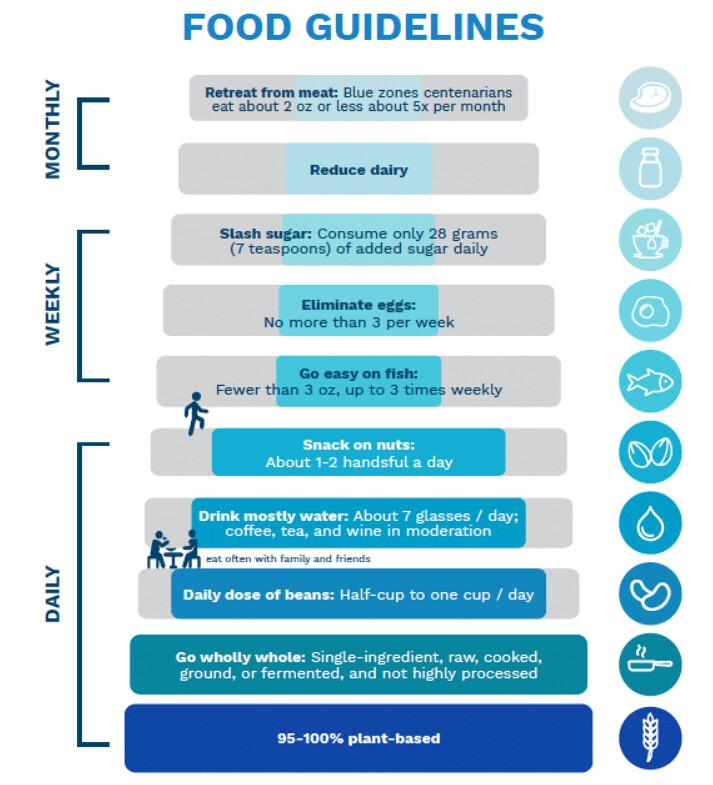
Blue Zone Food Guidelines [27]
Common Blue Zone lifestyle characteristics [29]
family coherence,
avoidance of smoking,
plant-based diet,
moderate and daily physical activity,
social engagement, where people of all ages are socially active and integrated into the community
Plant based diet accounts for half of the difference in Blue Zone lifespan [30]
Number 1 risk factor is American diet
A sustained change from a typical Western diet to the optimal diet from age 20 years would increase LE by more than a decade for women from the United States (10.7 [95% UI 8.4 to 12.3] years) and men (13.0 [95% UI 9.4 to 14.3] years). [31]
The largest gains would be made by eating more legumes (females: 2.2 [95% UI 1.1 to 3.4]; males: 2.5 [95% UI 1.1 to 3.9]),
[more] whole grains (females: 2.0 [95% UI 1.3 to 2.7]; males: 2.3 [95% UI 1.6 to 3.0]), and
[more] nuts (females: 1.7 [95% UI 1.5 to 2.0]; males: 2.0 [95% UI 1.7 to 2.3]), and
less red meat (females: 1.6 [95% UI 1.5 to 1.8]; males: 1.9 [95% UI 1.7 to 2.1]) and
[less] processed meat (females: 1.6 [95% UI 1.5 to 1.8]; males: 1.9 [95% UI 1.7 to 2.1]).
Changing from a typical diet to the optimized diet at age 60 years would increase LE by 8.0 (95% UI 6.2 to 9.3) years for women and 8.8 (95% UI 6.8 to 10.0) years for men, and
80-year-olds would gain 3.4 years (95% UI females: 2.6 to 3.8/ males: 2.7 to 3.9)
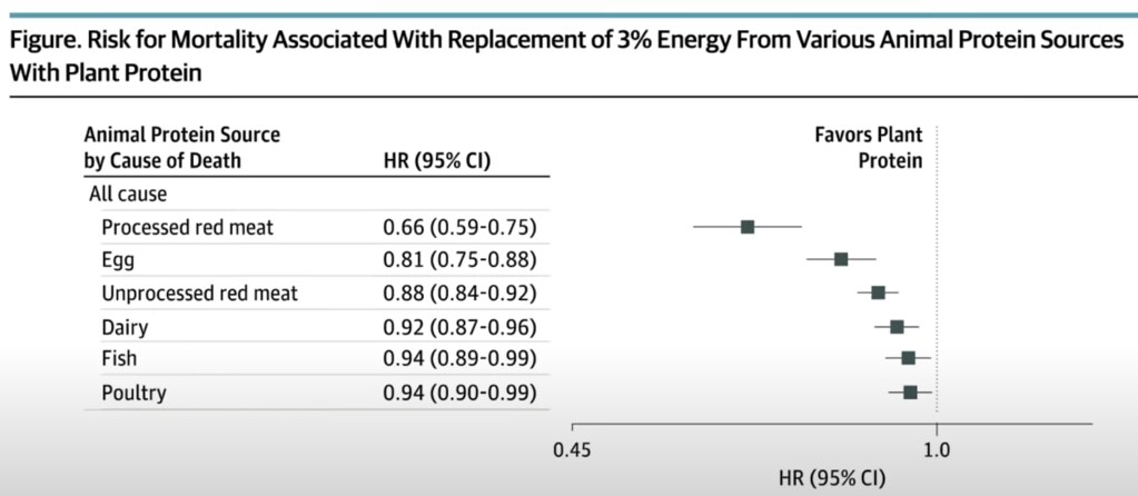
Replacing just 3% of animal protein with plant protein can improve life expectancy 10% [32]
Does eating healthy actually slow down aging?[33]
“Women who participated in the dietary intervention had a significant slowing of the DNAmGrimAge clock” [34]
“It’s not just about adding years to your life but life to your years.”
Unhealthy Aging Measure called Deficit Accumulation Index (DAI)
Deficit Accumulation Index. At each wave, unhealthy aging was measured using a 52-item DAI with 4 domains: functional impairments, self-reported health/vitality, mental health, and morbidities/use of health services. “…. substitution of 1% of energy from vegetable protein for an equal amount of total animal protein, dairy protein, or meat protein also led to significantly less deficit accumulation.” ” [35]
“Substituting 5% energy of animal protein with plant protein was associated with a lower risk of all‐cause mortality (HR, 0.86; 95% CI, 0.81–0.91), CVD mortality (HR, 0.78, 95% CI, 0.70–0.87), and dementia mortality (HR, 0.81, 95% CI, 0.68–0.97” [36]
Those who eat no meat at all are three times less likely to become demented “The matched subjects who ate meat (including poultry and fish) were more than twice as likely to become demented as their vegetarian counterparts (relative risk 2.18, p = 0.065) and the discrepancy was further widened (relative risk 2.99, p = 0.048) when past meat consumption was taken into account. “ [37]
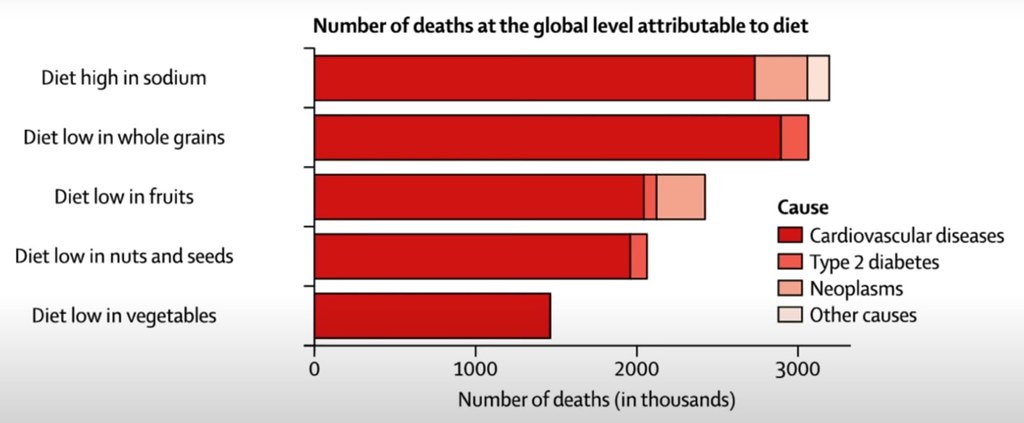
Sodium is the worst thing in our diet [38], Switching to half sodium/half potassium can increase life expectancy
“…. in high income and, increasingly, in middle-income countries, ultra-processed foods consistently account for more than 50% of dietary energy.”,[39]
Ultra-processed foods associated with increase risk of dying prematurely
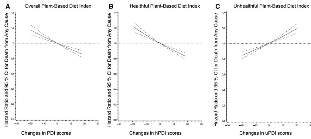
Unhealthy plant-based diets are not associated with a lower risk of dying[40]
Unhealthy plant based diets (uPDI) increase overall risk of death even if animal product consumption is low [41]
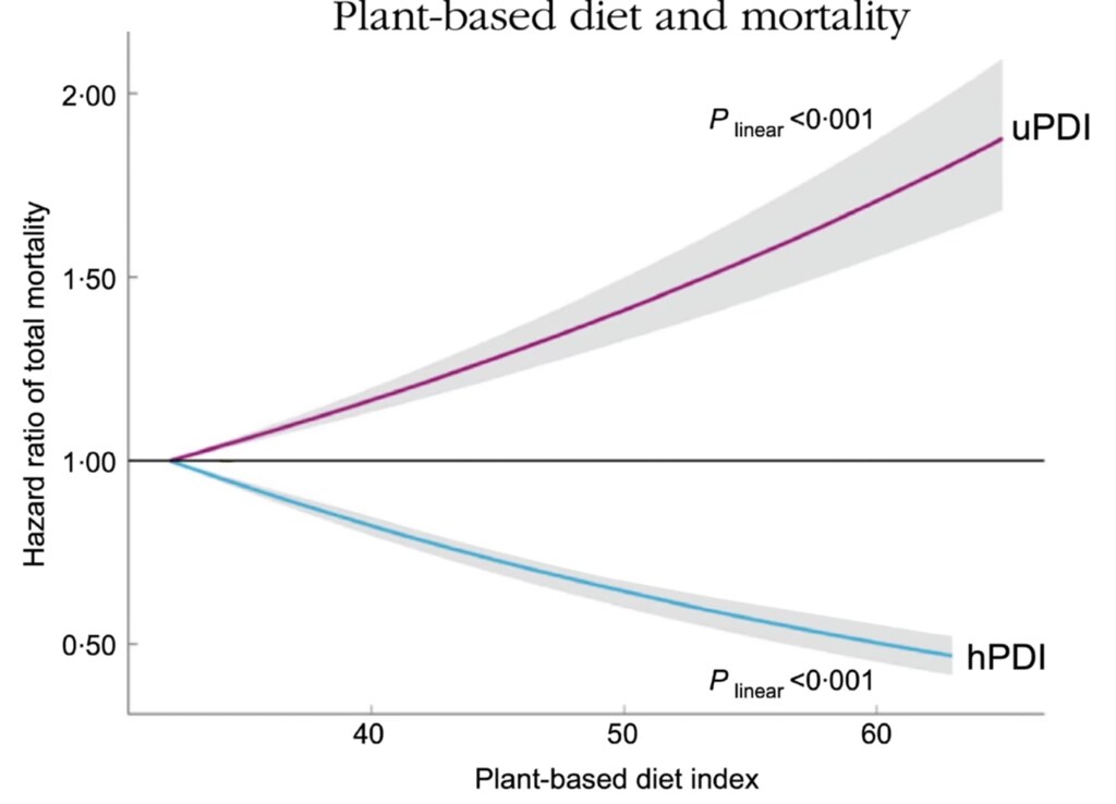
The Million Veteran study: Healthy plant foods (hPDI) decreases risk of death Unhealthy plant foods (uPDI) increases risk of death [42]
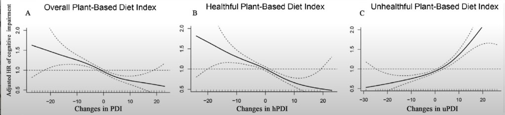
Only healthy plant foods reduce the risk of cognitive impairment [43]
Dr. Greger presented similar data for dementia and depression, frailty
“In order to distinguish between healthful and unhealthful vegan diets that majorly include refined and processed foods, the term whole food, plant-based diet was developed by Dr. T. Colin Campbell in the early 1980s. The current definition of a plant-based diet is one that consists of all minimally processed fruits, vegetables, whole grains, legumes, nuts, seeds, herbs, and spices and excludes all animal products, including red meat, fish, poultry, eggs, and dairy products.”[44]
Vegans can still benefit from whole food, plant-based diet [45]
References
[27] A great book to read is Buettner D. The Blue Zones: 9 Lessons for Living Longer from the People Who’ve Lived the Longest. 2nd ed. National Geographic Books; 2012. Cited as 1486 and 2403 in How Not to Age Citations. Dan Buettner has done much research on Blue Zones and has written other books. He also has a recent 2023 series on Netflix, Live to 100: Secrets of the Blue Zones [28] Food guidelines. BlueZones.com. https://www.bluezones.com/recipes/food-guidelines/. Accessed 2 December 2023 Cited as 2393 and 2396 in How Not to Age Citations
[29] Panagiotakos DB, Chrysohoou C, Siasos G, Zisimos K, Skoumas J, Pitsavos C, Stefanadis C. Sociodemographic and lifestyle statistics of oldest old people (>80 years) living in ikaria island: the ikaria study. Cardiol Res Pract. 2011 Feb 24;2011:679187. doi: 10.4061/2011/679187. PMID: 21403883; PMCID: PMC3051199. https://www.ncbi.nlm.nih.gov/pmc/articles/PMC3051199/ Cited as 2392 in How Not to Age Citations
[30] Kahleova H, Levin S, Barnard ND. Plant-Based Diets for Healthy Aging. J Am Coll Nutr. 2021 Jul;40(5):478-479. doi: 10.1080/07315724.2020.1790442. Epub 2020 Jul 9. PMID: 32643581. Behind a paywall Available at https://www.researchgate.net/publication/342818806_Plant-Based_Diets_for_Healthy_Aging Cited as 2147, 2150 and 2742 in How Not to Age Citations
[31] Fadnes LT, Økland JM, Haaland ØA, Johansson KA. Estimating impact of food choices on life expectancy: A modeling study. PLoS Med. 2022 Feb 8;19(2):e1003889. doi: 10.1371/journal.pmed.1003889. Erratum in: PLoS Med. 2022 Mar 25;19(3):e1003962. PMID: 35134067; PMCID: PMC8824353. https://www.ncbi.nlm.nih.gov/pmc/articles/PMC8824353/ Cited as 2216, 2406 and 2436 in How Not to Age Citations
[32] Song M, Fung TT, Hu FB, Willett WC, Longo VD, Chan AT, Giovannucci EL. Association of Animal and Plant Protein Intake With All-Cause and Cause-Specific Mortality. JAMA Intern Med. 2016 Oct 1;176(10):1453-1463. doi: 10.1001/jamainternmed.2016.4182. Erratum in: JAMA Intern Med. 2016 Nov 1;176(11):1728. PMID: 27479196; PMCID: PMC5048552. https://www.ncbi.nlm.nih.gov/pmc/articles/PMC5048552/ Cited as 3747, 3750 and 3752 in How Not to Age Citations
[33] Fiorito G, Caini S, Palli D, Bendinelli B, Saieva C, Ermini I, Valentini V, Assedi M, Rizzolo P, Ambrogetti D, Ottini L, Masala G. DNA methylation-based biomarkers of aging were slowed down in a two-year diet and physical activity intervention trial: the DAMA study. Aging Cell. 2021 Oct;20(10):e13439. doi: 10.1111/acel.13439. Epub 2021 Sep 18. PMID: 34535961; PMCID: PMC8520727. https://www.ncbi.nlm.nih.gov/pmc/articles/PMC8520727/ Not cited in How Not to Age Citations
[34] DNAmGrimAge clock, whereas increasing physical activity led to a significant reduction of SEMs in crucial cancer‐related pathways.” Since the article states: “stochastic epigenetic mutations (SEMs), also known as the epigenetic mutation load (EML), has been proposed as a complementary DNAm‐based biomarker of healthy aging.” then a reduction in SEMs would be beneficial. In other words, increased physical activity does “reduce” aging which is contrary to what Dr. Greger said
[35] Ortolá R, Struijk EA, García-Esquinas E, Rodríguez-Artalejo F, Lopez-Garcia E. Changes in Dietary Intake of Animal and Vegetable Protein and Unhealthy Aging. Am J Med. 2020 Feb;133(2):231-239.e7. doi: 10.1016/j.amjmed.2019.06.051. Epub 2019 Jul 29. PMID: 31369726. Behind paywall but found at https://www.fisiogenomica.com/assets/Blog/pdf/Prote%C3%ADnas%2010.1016@j.amjmed.2019.06.051.pdf Cited as 2762, 2763, 5535, 5664, and 7902 in How Not to Age Citations but the link is to the wrong paper
[36] Sun Y, Liu B, Snetselaar LG, Wallace RB, Shadyab AH, Kroenke CH, Haring B, Howard BV, Shikany JM, Valdiviezo C, Bao W. Association of Major Dietary Protein Sources With All-Cause and Cause-Specific Mortality: Prospective Cohort Study. J Am Heart Assoc. 2021 Feb;10(5):e015553. doi: 10.1161/JAHA.119.015553. Epub 2021 Feb 24. PMID: 33624505; PMCID: PMC8174240. https://www.ahajournals.org/doi/10.1161/JAHA.119.015553 Cited as references 951, 3752, 6763 and 7903 in in How Not to Age Citations
[37] Giem P, Beeson WL, Fraser GE. The incidence of dementia and intake of animal products: preliminary findings from the Adventist Health Study. Neuroepidemiology. 1993;12(1):28-36. doi: 10.1159/000110296. PMID: 8327020. Behind paywall Cited as references 51, 744, 2747. 5048 and 5532 in in How Not to Age Citations
[38]
GBD 2017 Diet Collaborators. Health effects of dietary risks in 195 countries, 1990-2017: a systematic analysis for the Global Burden of Disease Study 2017. Lancet. 2019 May 11;393(10184):1958-1972. doi: 10.1016/S0140-6736(19)30041-8. Epub 2019 Apr 4. Erratum in: Lancet. 2021 Jun 26;397(10293):2466. PMID: 30954305; PMCID: PMC6899507. https://www.ncbi.nlm.nih.gov/pmc/articles/PMC6899507/ Cited as references 1261, 2104, 2115, and 2163 in in How Not to Age Citations
[39] Adams J, Hofman K, Moubarac JC, Thow AM. Public health response to ultra-processed food and drinks. BMJ. 2020 Jun 26;369:m2391. doi: 10.1136/bmj.m2391. PMID: 32591348; PMCID: PMC7318879.https://www.ncbi.nlm.nih.gov/pmc/articles/PMC7318879/ Not referenced in How Not to Age Citations
Definition of Ultra-processed food and drink products -Formulations of ingredients, mostly of exclusive industrial use, that result from a series of industrial processes, many requiring sophisticated equipment and technology. These include the fractioning of whole foods into substances, chemical modifications of these substances, assembly of unmodified and modified food substances using industrial techniques such as extrusion, moulding and pre-frying, frequent application of additives whose function is to make the final product palatable or hyper-palatable (cosmetic additives), and sophisticated packaging, usually with synthetic materials
Examples of Ultra-processed food and drink products – Carbonated drinks; ice cream, chocolate, confectionery; mass produced packaged breads and buns; margarines and spreads; biscuits, pastries, cakes, and cake mixes; breakfast cereals, cereal and energy bars; energy drinks; milk drinks, fruit yoghurts, and fruit drinks; meat and chicken extracts and instant sauces; infant formula milks and other baby products; health and slimming products such as meal substitutes; many ready to heat products, including pies, pasta dishes, and pizza; poultry and fish nuggets, sausages, burgers, and hot dogs; and instant soups, noodles, and desserts
[40] Kim H, Caulfield LE, Rebholz CM. Healthy Plant-Based Diets Are Associated with Lower Risk of All-Cause Mortality in US Adults. J Nutr. 2018 Apr 1;148(4):624-631. doi: 10.1093/jn/nxy019. PMID: 29659968; PMCID: PMC6669955. https://www.ncbi.nlm.nih.gov/pmc/articles/PMC6669955/ Cited as references 2145, and 2791 in in How Not to Age Citations
The referenced paper is much more equivocal: “We did not observe significant results for the healthy plant-based diets and cardiovascular disease mortality in the overall study population, or in sex-specific strata.”
[41] Baden MY, Liu G, Satija A, Li Y, Sun Q, Fung TT, Rimm EB, Willett WC, Hu FB, Bhupathiraju SN. Changes in Plant-Based Diet Quality and Total and Cause-Specific Mortality. Circulation. 2019 Sep 17;140(12):979-991. doi: 10.1161/CIRCULATIONAHA.119.041014. Epub 2019 Aug 12. PMID: 31401846; PMCID: PMC6746589. https://www.ncbi.nlm.nih.gov/pmc/articles/PMC6746589/ Cited as references 2800 in in How Not to Age Citations
[43] Ding K, Zeng J, Zhang X, Wang Y, Liang F, Wang L, Guo T, Moore JB, Li R. Changes in Plant-Based Dietary Quality and Subsequent Risk of Cognitive Impairment Among Older Chinese Adults: a National Community-Based Cohort Study. Am J Clin Nutr. 2023 Jul;118(1):201-208. doi: 10.1016/j.ajcnut.2023.05.018. Epub 2023 May 13. PMID: 37187294. Behind Paywall Not referenced in How Not to Age citations, it’s a recent 2023 paper.
[44] Rocha JP, Laster J, Parag B, Shah NU. Multiple Health Benefits and Minimal Risks Associated with Vegetarian Diets. Curr Nutr Rep. 2019 Dec;8(4):374-381. doi: 10.1007/s13668-019-00298-w. PMID: 31705483. Behind paywall, Cited as references 2785 in in How Not to Age Citations
[45] Campbell EK, Fidahusain M, Campbell Ii TM. Evaluation of an Eight-Week Whole-Food Plant-Based Lifestyle Modification Program. Nutrients. 2019 Sep 3;11(9):2068. doi: 10.3390/nu11092068. PMID: 31484341; PMCID: PMC6770132. https://www.ncbi.nlm.nih.gov/pmc/articles/PMC6770132/ Cited as reference 2787 in How Not to Age Citations
I watched a YouTube presentation by Dr. Greger that introduces his new book “How Not to Age” and decided I would make a few notes. The book will be released on 5 December 2023 and I plan to read it. One thing led to another and now I have a pretty detailed set of notes on this presentation that I think might be useful to others. This is part 1 of a series of posts, it covers the first 21 minutes of the talk. If there are errors in this post, they are likely mine, let me know and I will correct it. I learned a couple of things from this talk: 1. increase my intake of foods that contain spermidine; I am adding wheat germ to my diet every day. 2. Investigate fasting to increase autophagy [11] 3. When possible, try to exercise for 60 minutes or longer [13] 4. Can’t wait to read the book but I also wanted to read a few of the papers.
I researched the citations to some of the papers that Dr. Greger cites in the talk. One reason I did this is to keep up with the sheer volume of research that he uses in the talk; he covers a lot of ground. It was interesting to see that some of the papers cited in his talk aren’t included in “How Not to Age”.
Notes for Part 1
Centenarians die of disease; not old age
Aging kills via disease, why wasn’t “How Not to Die” a good enough book?
BUT rate of death increases exponentially as we age
Risk doubles about every 7 years
Age is the leading risk factor for disease
Cholesterol is a modifiable risk factor
What if the rate of aging was modifiable?
Slowing down the rate of aging would address risk from many diseases.
“My aim was to cover every possible angle for developing the optimal diet and lifestyle for the longest, healthiest lifespan based on the best available balance of evidence.” Dr. Greger’s goal
Experts such as Valter Longo and David Sinclair have identified essential pathways that can be modified by drugs [1]
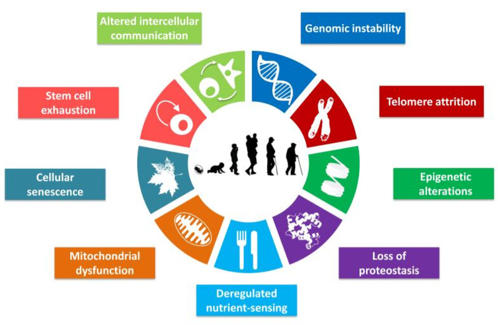
Dr. Greger realized these eleven pathways can be modified via diet
Part 1“Slowing Aging by Blocking Eleven Pathways to Aging”
The phrase “anti-aging” is greatly abused in popular culture, often for the purpose of marketing cosmetic procedures or unproven nutritional supplements purported to slow or reverse aging. This has the unfortunate consequence of creating confusion among the general public and diminishing the impact of legitimate scientific discovery. Here, we define “anti-aging” as delaying or reversing biological aging by targeting the established molecular mechanisms of aging, which have been formalized as “hallmarks” or “pillars” of aging. [2]
Hallmarks of Aging
Figure 1. The Hallmarks of Aging The scheme enumerates the nine hallmarks described in this review: genomic instability, telomere attrition, epigenetic alterations, loss of proteostasis, deregulated nutrient-sensing, mitochondrial, dysfunction, cellular senescence, stem cell exhaustion, and altered intercellular communication. [3]
[7:30] Autophagy “Self-eating” housekeeping process by which defective cellular components are scrapped for spare parts clearing out damage implicated in aging process
Autophagy, a term acquired from the Greek words “auto (self)” and “phagein (to eat)”, literally meaning “self-eating”, refers to an evolutionary conserved catabolic mechanism that allows cells to remove their own unnecessary or dysfunctional components.[4]
Autophagy critical for lifespan and healthspan extension
Proteostasis is supported by autophagy, a conserved machinery that helps to eliminate dysfunctional proteins and cellular organelles via lysosomal degradation. The rejuvenating power of cleaning up garbage and replacing it with recycled and newly synthesized cellular components speaks to the imagination and is an attractive explanation for the positive correlation between autophagy and lifespan.[5]
…. mounting evidence suggesting that autophagy is not only necessary but, at least in some cases, also sufficient for increasing longevity.[6]
…. specific activation of autophagy through a mutation in beclin 1 prolongs median survival by approximately 12% in both male and female mice. [7]
A decrease in autophagy with age has been described in almost all organisms and tissues analyzed.[8]
Pharma wants to exploit autophagy using drugs
To circumvent such diseases of aging, efforts to pharmacologically modulate autophagy are at the forefront of multiple research programs in academia and the pharmaceutical industry.[9]
Fasting can cause autophagy [10]
Don’t fast longer than 24 hours without medical help
Fasting periods lasting longer than 24 hours and particularly those lasting 3 or more days should be done under the supervision of a physician and preferably in a clinic.[11]
Exercise can cause autophagy [12]
Activated after more than 60 minutes of moderate exercise These data demonstrate that autophagy signaling is activated in human skeletal muscle after 60 min of exercise, independently of nutritional status, and suggest that initiation of autophagy constitutes an important physiological response to exercise in humans.[13]
Diet can inhibit autophagy
Acrylamide – in deep fried foods (fries, chips) causes inflammation [14][15]
Put it to the test – some evidence
Air frying is better [16]
Coffee (including decaf) can activate autophagy [17]
Bioactive compounds other than caffeine
Chlorogenic acids (CGA)
Spermidine rich foods activate autophagy[18]
Levels decline with age (except in naked mole rats which don’t age [19])
Largest documented lifespan extension [20]
Improves cardiac, [21] immune, [22] and brain function in animals
In humans, greatest consumption of spermidine has lowest mortality[24]
An anti-aging vitamin to maintain autophagy In sum, in our view, spermidine is synthesized by our organism in sufficient quantities during youth, but not in old age. Thus, one may argue that, as we age, spermidine evolves to the status of a vitamin, and thus has to be supplemented from external sources to secure the maintenance of autophagic flux required for organismal homeostasis. [25]
Wheat germ is the most concentrated source of spermidine, 2.5 mg per tablespoon
Caused improvement in mild dementia patients
Work much better than Aducanumab anti-Alzheimer drug
Autophagy Takeaways (summary from “How Not to Age”)[26] To help slow this aging pathway, on a daily basis, consider.
60 min or more of moderate to vigorous (55%-70% VO2 max) aerobic exercise
minimizing your intake of french fries and potato chips
drinking three cups of regular or decaffeinated coffee
trying to consume at least 20 mg of spermidine by incorporating foods such as tempeh, mushrooms, peas, and wheat germ into your diet
instituting the recommendations to activate AMPK (see chapter 1)
following the recommendations to suppress mTOR (see chapter 8) “How Not to Age” diet and lifestyle takeaways for 10 other aging pathways
References
[1] Longo VD, Antebi A, Bartke A, Barzilai N, Brown-Borg HM, Caruso C, Curiel TJ, de Cabo R, Franceschi C, Gems D, Ingram DK, Johnson TE, Kennedy BK, Kenyon C, Klein S, Kopchick JJ, Lepperdinger G, Madeo F, Mirisola MG, Mitchell JR, Passarino G, Rudolph KL, Sedivy JM, Shadel GS, Sinclair DA, Spindler SR, Suh Y, Vijg J, Vinciguerra M, Fontana L. Interventions to Slow Aging in Humans: Are We Ready? Aging Cell. 2015 Aug;14(4):497-510. doi: 10.1111/acel.12338. Epub 2015 Apr 22. PMID: 25902704; PMCID: PMC4531065 https://pubmed.ncbi.nlm.nih.gov/25902704/ Not referenced in How Not to Age Citations
[2] Lee MB, Hill CM, Bitto A, Kaeberlein M. Antiaging diets: Separating fact from fiction. Science. 2021 Nov 19;374(6570):eabe7365. doi: 10.1126/science.abe7365. Epub 2021 Nov 19. PMID: 34793210; PMCID: PMC8841109. PMC8841109. https://www.ncbi.nlm.nih.gov/pmc/articles/PMC8841109/ Cited as references 108, 7648, 7784 and 7996 in How Not to Age Citations
[3] López-Otín C, Blasco MA, Partridge L, Serrano M, Kroemer G. The hallmarks of aging. Cell. 2013 Jun 6;153(6):1194-217. doi: 10.1016/j.cell.2013.05.039. PMID: 23746838; PMCID: PMC3836174. https://www.ncbi.nlm.nih.gov/pmc/articles/PMC3836174/ Cited as reference 142 and 556 in How Not to Age Citations
[4] Pietrocola F, Bravo-San Pedro JM. Targeting Autophagy to Counteract Obesity-Associated Oxidative Stress. Antioxidants (Basel). 2021 Jan 12;10(1):102. doi: 10.3390/antiox10010102. PMID: 33445755; PMCID: PMC7828170. https://www.ncbi.nlm.nih.gov/pmc/articles/PMC7828170/ Not referenced in How Not to Age Citations
[5] Dantuma NP, Hoppe T, Herzog LK. The price of longevity. Aging (Albany NY). 2020 Nov 28;12(22):22350-22351. doi: 10.18632/aging.104215. Epub 2020 Nov 28. PMID: 33253121; PMCID: PMC7746350. https://www.ncbi.nlm.nih.gov/pmc/articles/PMC7746350/ Not referenced in How Not to Age Citations
[6] Madeo F, Zimmermann A, Maiuri MC, Kroemer G. Essential role for autophagy in life span extension. J Clin Invest. 2015 Jan;125(1):85-93. doi: 10.1172/JCI73946. Epub 2015 Jan 2. PMID: 25654554; PMCID: PMC4382258. https://www.ncbi.nlm.nih.gov/pmc/articles/PMC4382258/ Cited as references 240 and 257 in How Not to Age Citations
[7] Arensman MD, Eng CH. Self-Digestion for Lifespan Extension: Enhanced Autophagy Delays Aging. Mol Cell. 2018 Aug 16;71(4):485-486. doi: 10.1016/j.molcel.2018.08.002. PMID: 30118677. https://linkinghub.elsevier.com/retrieve/pii/S1097-2765(18)30636-1 Not referenced in How Not to Age Citations
[9] Wong SQ, Kumar AV, Mills J, Lapierre LR. Autophagy in aging and longevity. Hum Genet. 2020 Mar;139(3):277-290. doi: 10.1007/s00439-019-02031-7. Epub 2019 May 30. PMID: 31144030; PMCID: PMC6884674. https://www.ncbi.nlm.nih.gov/pmc/articles/PMC6884674/ Cited as reference 242 in How Not to Age Citations
[10] Mani K, Javaheri A, Diwan A. Lysosomes Mediate Benefits of Intermittent Fasting in Cardiometabolic Disease: The Janitor Is the Undercover Boss. Compr Physiol. 2018 Sep 14;8(4):1639-1667. doi: 10.1002/cphy.c180005. PMID: 30215867; PMCID: PMC6423516.https://www.ncbi.nlm.nih.gov/pmc/articles/PMC6423516/ Cited as references 7661 in How Not to Age Citations
[11] Longo VD, Mattson MP. Fasting: molecular mechanisms and clinical applications. Cell Metab. 2014 Feb 4;19(2):181-92. doi: 10.1016/j.cmet.2013.12.008. Epub 2014 Jan 16. PMID: 24440038; PMCID: PMC3946160. https://www.ncbi.nlm.nih.gov/pmc/articles/PMC3946160/ Cited as references 7598 and 7837 in How Not to Age Citations
[12] He C, Sumpter R Jr, Levine B. Exercise induces autophagy in peripheral tissues and in the brain. Autophagy. 2012 Oct;8(10):1548-51. doi: 10.4161/auto.21327. Epub 2012 Aug 15. PMID: 22892563; PMCID: PMC3463459. https://www.ncbi.nlm.nih.gov/pmc/articles/PMC3463459/ Not referenced in How Not to Age Citations
[13] Møller AB, Vendelbo MH, Christensen B, Clasen BF, Bak AM, Jørgensen JO, Møller N, Jessen N. Physical exercise increases autophagic signaling through ULK1 in human skeletal muscle. J Appl Physiol (1985). 2015 Apr 15;118(8):971-9. doi: 10.1152/japplphysiol.01116.2014. Epub 2015 Feb 12. PMID: 25678702. https://journals.physiology.org/doi/10.1152/japplphysiol.01116.2014 Not referenced in How Not to Age Citations
[14] Song D, Xu C, Holck AL, Liu R. Acrylamide inhibits autophagy, induces apoptosis and alters cellular metabolic profiles. Ecotoxicol Environ Saf. 2021 Jan 15;208:111543. doi: 10.1016/j.ecoenv.2020.111543. Epub 2020 Nov 9. PMID: 33396091. https://www.sciencedirect.com/science/article/pii/S0147651320313804 Cited as reference 253 in How Not to Age Citations
[15] Naruszewicz M, Zapolska-Downar D, Kośmider A, Nowicka G, Kozłowska-Wojciechowska M, Vikström AS, Törnqvist M. Chronic intake of potato chips in humans increases the production of reactive oxygen radicals by leukocytes and increases plasma C-reactive protein: a pilot study. Am J Clin Nutr. 2009 Mar;89(3):773-7. doi: 10.3945/ajcn.2008.26647. Epub 2009 Jan 21. Erratum in: Am J Clin Nutr. 2009 Jun;89(6):1951. PMID: 19158207. https://linkinghub.elsevier.com/retrieve/pii/S0002-9165(23)23747-8 Cited as reference 253 in How Not to Age Citations
[16] Sansano M, Juan-Borrás M, Escriche I, Andrés A, Heredia A. Effect of pretreatments and air-frying, a novel technology, on acrylamide generation in fried potatoes. J Food Sci. 2015 May;80(5):T1120-8. doi: 10.1111/1750-3841.12843. Epub 2015 Apr 13. PMID: 25872656. Not referenced in How Not to Age Citations
[17] Pietrocola F, Malik SA, Mariño G, Vacchelli E, Senovilla L, Chaba K, Niso-Santano M, Maiuri MC, Madeo F, Kroemer G. Coffee induces autophagy in vivo. Cell Cycle. 2014;13(12):1987-94. doi: 10.4161/cc.28929. Epub 2014 Apr 25. PMID: 24769862; PMCID: PMC4111762. Cited as reference 255 in How Not to Age Citations
[18] Madeo F, Eisenberg T, Büttner S, Ruckenstuhl C, Kroemer G. Spermidine: a novel autophagy inducer and longevity elixir. Autophagy. 2010 Jan;6(1):160-2. doi: 10.4161/auto.6.1.10600. PMID: 20110777. Not referenced in How Not to Age Citations
[19] Viltard M, Durand S, Pérez-Lanzón M, Aprahamian F, Lefevre D, Leroy C, Madeo F, Kroemer G, Friedlander G. The metabolomic signature of extreme longevity: naked mole rats versus mice. Aging (Albany NY). 2019 Jul 24;11(14):4783-4800. doi: 10.18632/aging.102116. PMID: 31346149; PMCID: PMC6682510. Cited as reference 323 in How Not to Age Citations
[20] Eisenberg T, Knauer H, Schauer A, Büttner S, Ruckenstuhl C, Carmona-Gutierrez D, Ring J, Schroeder S, Magnes C, Antonacci L, Fussi H, Deszcz L, Hartl R, Schraml E, Criollo A, Megalou E, Weiskopf D, Laun P, Heeren G, Breitenbach M, Grubeck-Loebenstein B, Herker E, Fahrenkrog B, Fröhlich KU, Sinner F, Tavernarakis N, Minois N, Kroemer G, Madeo F. Induction of autophagy by spermidine promotes longevity. Nat Cell Biol. 2009 Nov;11(11):1305-14. doi: 10.1038/ncb1975. Epub 2009 Oct 4. PMID: 19801973. Cited as reference 319 in How Not to Age Citations
[21] Eisenberg T, Abdellatif M, Schroeder S, Primessnig U, Stekovic S, Pendl T, Harger A, Schipke J, Zimmermann A, Schmidt A, Tong M, Ruckenstuhl C, Dammbrueck C, Gross AS, Herbst V, Magnes C, Trausinger G, Narath S, Meinitzer A, Hu Z, Kirsch A, Eller K, Carmona-Gutierrez D, Büttner S, Pietrocola F, Knittelfelder O, Schrepfer E, Rockenfeller P, Simonini C, Rahn A, Horsch M, Moreth K, Beckers J, Fuchs H, Gailus-Durner V, Neff F, Janik D, Rathkolb B, Rozman J, de Angelis MH, Moustafa T, Haemmerle G, Mayr M, Willeit P, von Frieling-Salewsky M, Pieske B, Scorrano L, Pieber T, Pechlaner R, Willeit J, Sigrist SJ, Linke WA, Mühlfeld C, Sadoshima J, Dengjel J, Kiechl S, Kroemer G, Sedej S, Madeo F. Cardioprotection and lifespan extension by the natural polyamine spermidine. Nat Med. 2016 Dec;22(12):1428-1438. doi: 10.1038/nm.4222. Epub 2016 Nov 14. PMID: 27841876; PMCID: PMC5806691 https://www.ncbi.nlm.nih.gov/pmc/articles/PMC5806691/ Cited as references 325, 327. 336, 338 and 402 in How Not to Age Citations
[22] Castoldi F, Kroemer G, Pietrocola F. Spermidine rejuvenates T lymphocytes and restores anticancer immunosurveillance in aged mice. Oncoimmunology. 2022 Nov 14;11(1):2146855. doi: 10.1080/2162402X.2022.2146855. PMID: 36387057; PMCID: PMC9665084.Not referenced in How Not to Age Citations
[23] Schroeder S, Hofer SJ, Zimmermann A, Pechlaner R, Dammbrueck C, Pendl T, Marcello GM, Pogatschnigg V, Bergmann M, Müller M, Gschiel V, Ristic S, Tadic J, Iwata K, Richter G, Farzi A, Üçal M, Schäfer U, Poglitsch M, Royer P, Mekis R, Agreiter M, Tölle RC, Sótonyi P, Willeit J, Mairhofer B, Niederkofler H, Pallhuber I, Rungger G, Tilg H, Defrancesco M, Marksteiner J, Sinner F, Magnes C, Pieber TR, Holzer P, Kroemer G, Carmona-Gutierrez D, Scorrano L, Dengjel J, Madl T, Sedej S, Sigrist SJ, Rácz B, Kiechl S, Eisenberg T, Madeo F. Dietary spermidine improves cognitive function. Cell Rep. 2021 Apr 13;35(2):108985. doi: 10.1016/j.celrep.2021.108985. PMID: 33852843. https://linkinghub.elsevier.com/retrieve/pii/S2211-1247(21)00299-0 Not referenced in How Not to Age Citations
[24] Kiechl S, Pechlaner R, Willeit P, Notdurfter M, Paulweber B, Willeit K, Werner P, Ruckenstuhl C, Iglseder B, Weger S, Mairhofer B, Gartner M, Kedenko L, Chmelikova M, Stekovic S, Stuppner H, Oberhollenzer F, Kroemer G, Mayr M, Eisenberg T, Tilg H, Madeo F, Willeit J. Higher spermidine intake is linked to lower mortality: a prospective population-based study. Am J Clin Nutr. 2018 Aug 1;108(2):371-380. doi: 10.1093/ajcn/nqy102. PMID: 29955838. https://linkinghub.elsevier.com/retrieve/pii/S0002-9165(22)02930-6 Cited as references 339, 340, 341, 353. 357. 367, 372, 376, 380, 381, 388, 414, 416, 425, 431 and 4440 in How Not to Age Citations
[25] Madeo F, Bauer MA, Carmona-Gutierrez D, Kroemer G. Spermidine: a physiological autophagy inducer acting as an anti-aging vitamin in humans? Autophagy. 2019 Jan;15(1):165-168. doi: 10.1080/15548627.2018.1530929. Epub 2018 Oct 11. PMID: 30306826; PMCID: PMC6287690. https://www.ncbi.nlm.nih.gov/pmc/articles/PMC6287690/ Cited as references 311 and 342 in How Not to Age Citations
[26] Greger, M. (2023). How Not to Age: The Scientific Approach to Getting Healthier As You Get Older.