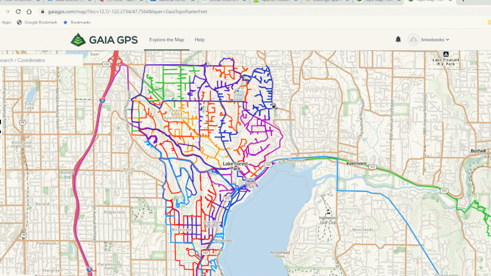
I did an interesting project in April, 2020 to keep in shape while staying at home during the COVID-19 pandemic. I ran and walked every street and a few trails in my town of Lake Forest Park, Washington.
I ended up doing 15 runs over 22 days for a total of 159.8 miles. My shortest run was 4 miles and the longest was over 21 miles. The average was about 7.2 miles. Our town has a few hills; my elevation gain was 10,730 feet (about the height of Mount Baker). For every run, I knew the area I wanted to explore but not the detailed path. The first thing I had to do was hike up the hill of our street and decide whether to go right or left?
Which way should I go today?
Along the way, I discovered lots of interesting places in my town and visited areas I’d never been to. I talked to a number of great people (from a distance), discovered some great views, enjoyed the spring beauty and had a lot of fun. Here’s a few images, there are more in my Run LFP 2020 album on Flickr.
The biggest little library I’d ever seen, I found my kind of book!Creative ideaWonderful placeDone!
Here’s some reasonably good news, the rate of spread of COVID-19 is decreasing significantly in King and Snohomish County, Washington. Here’s a plot that illustrates the reduction in spread based on new cases.
Figure 1: Logarithm of cumulative COVID-19 infections in King and Snohomish County, Washington versus time (11 March, 2020) to 7 April, 2020
The yellow, circular data points are a count of the actual cases as reported by King and Snohomish County Department of Health. The blue, red and green lines with constant slopes represent the exponential increase in COVID-19 infections predicted using an exponential model with doubling times that were altered to estimate the effectiveness of social distancing.
The blue (baseline) slope predicts the number of infections based on a doubling rate of 6.2 days; this is the case if no social distancing methods were employed. The actual cases (yellow) closely tracked the blue slope from 11 to 17 March, 2020. In the next week interval (18-24 March, 2020) the slope of the actual cases deviated from the blue line towards the red line which was an estimate of social distancing becoming more effective; that is manifest as a 25% increase in the doubling time to spread the virus.
In the last few days (28-30 March, 2020), the number of actual cases appears to be flattening out again. If that trend continues, that’s very good new for King and Snohomish County as it indicates significant reduction in the spread of the COVID-19 virus.
Update 31 March 2020
Here’s a different way to look at the data, suggested to me by my colleague Luis. This visualization based on a a trajectory method developed by Aatish Bhatia and Henry Reich using average weekly data plotted against cumulative data. [3] This is a lagging indicator, so I expect it to be delayed in signaling a downturn. That said, it’s likely to be a strong, positive signal.
Governor Jay Inslee said on 26 March 2020 that our state has shown a “modest improvement” in stemming the COVID-19 infection rate. [1] As a young engineer I learned: “You can’t manage what you can’t measure.”[2]
This graph is my attempt to measure the effectiveness of our current social distancing measures are using the daily count of COVID-19 cases in King and Snohomish county. I am comparing the actual cases (in yellow, labeled First Diff Actual) to an exponential model I used to project the spread of infection. [3] The solid blue, red and green lines are projected increases in daily new COVID-19 cases for three scenarios starting on 10 March: baseline (no social distancing- red line, 25% reduction due to social distancing – blue line , and 50% reduction due to social distancing – green line. Our modest improvement (the yellow data falling in between the read and blue lines) seems to track the effects of 25% reduction in COVID-19 spread due to social distancing. What does this mean for King and Snohomish county in the near future?
The figure below shows three possible scenarios. The red line projects about 10,000 COVID-19 cases on 7 April. This seems to be our current trajectory. This is a large improvement over the baseline blue line of 25,000 COVID-19 cases on 7 April if we had done nothing.
As a colleague pointed out to me, the cumulative data is easier to visualize using a logarithmic plot as follows:
Have we done enough? That’s a question each of us need to address. Our leaders, like Governor Inslee, have provided us the framework to follow, it’s up to us to follow as best we can. I will also suggest listening to an excellent TED talk from Bill Gates
I suggest listening to an excellent TED talk from Bill Gates on other ways to respond to our pandemic, he discusses isolation , testing and the future.
There’s a plot that has been stuck in my brain for about 10 days:
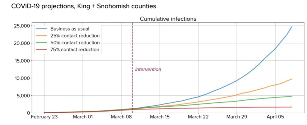
Part of Figure 1. Scenarios for the possible cumulative burden of COVID-19 infection in King and Snohomish counties. (Klein et. al.. 2020)
The plot is based on an infection model that was published by a team of researchers in the Seattle area who projected future Covid-19 cumulative infections for King and Snohomish (I’ll use the term Sno-King) over a four week interval commencing on 11 March. (Klein et. al., 2020) [1] I wanted to understand how our communities are doing in the struggle to slow the rate of new infections.
We do not yet know which scenario best represents current conditions in King and Snohomish counties, but previous experience in the region with weather-related social distancing and in other countries suggests to us that current efforts will likely land between baseline and 25% reduction scenarios.
(Klein et. al., 2020) on 11 March 2020
I believe there’s enough data (as of 25 March 2020) to claim that the Sno-King population has achieved the 25% reduction level due to social distancing. That’s certainly an improvement over two weeks but there’s still more work to be done. I’ll present some results from a very simple model I made and then discuss how I made this model, what its limitations are and suggest some improvements.
In Figure 1 below, the blue curve is a projection using an exponential model of the baseline for new infections for 28 days ending on 7 April 2020. The red curve is a projection of a 25% reduction in infection rate. The intent of these curves was to reproduce the model curves of Klein et. al. Finally, the yellow curves plots the number of cases in Sno-King. The underlying data, model and plots are available on a Google Sheet I created.
Figure 1: Cumulative Covid-19 infections, Exponential model King and Snohomish Counties, updated 25 March 2020
Now, I realize that it’s difficult to see much from this curve. I looked at the change in new daily infections, I believe that’s a better metric to visualize how we are improving. Figure 2 provides this visualization with the yellow data points show the daily increase in new cases compared to the baseline (blue) and 25% reduction (red) lines. I realize that there’s not very much data yet but we are seeing new data being published daily (and I will update this analysis sheet daily). Still, this made me realize that we are likely achieving 25% reduction level due to social distancing in Sno-King!
Figure 2: Daily increase in Covid-19 infections, Exponential model King and Snohomish Counties, updated 25 March 2020
Building the Exponential Model
Since I’m an engineer, the first thing I did was build my own model and then start feeding in data to measure how we are doing.Of course, the devil is in the details, and I’m not an epidemiologist. What I did was reproduce the results of Klein et. al.. 2020 using the facts they provided: a doubling time for the epidemic of 6.2 days, one large transmission cluster, four week duration, and less than 1% (25,000 of the 3 million infected at the end of the four weeks.
Let me explain the simple, deterministic model I used. To follow along, you may find it helpful to look at the underlying Google Sheet I developed. I am including underlying cell references in parentheses. I used an exponential increasing model that starts with 267 infections (cell L2) at day zero. For a time series of 28 days (cells F2:F30), I calculated the total number of infections using a baseline doubling rate parameter of 6.2 days (cell L3). For the entire 28 days, the baseline I calculated was 24,425 cumulative cases (cell G30). For comparison, the multiple simulations performed by Klein et. al. estimated 25,000 cumulative cases. Thus, my baseline model estimate is about 2% lower than Klein et. al.
For the the social distancing intervention representing a 25% reduction, I increased the baseline doubling rate parameter by a factor of 1.25 to 7.8 days (cell L4) For the 25% reduction case, I calculated was 9,899 cumulative cases (cell H30). For comparison, the multiple simulations performed by Klein et. al. estimated 9,700 cumulative cases. Thus, my model estimate is about 2% higher than Klein et. al. in the the 25% reduction case.
Next, I used the graphic “COVID-19 in Washington State” published daily by the Seattle Times to determine the cumulative number of cases in King (C3:C16) and Snohomish (D3:D16) county for each day and then computed the Sno-King total cases (E3:E16). I have included a tab labeled “DataSource” that lists the URL for each day’s data. Some days, the actual case data is suspect, for example, there was disagreement between King County and Washington State regarding cases on 17 March 2020. The cumulative infections are plotted for the baseline, 25% reduction, and actual cases in the chart labeled “Cumul25March”
I computed the first order difference in infections, the change in number of daily infections, for each condition: baseline (cells J3:J16), 25% reduction (cells K3:K16) and actual cases (cells I3:I16). The change in number of daily infections are plotted for the baseline, 25% reduction, and actual cases in the chart labeled “1stDiff25March”
Limitations and Utility of this Model
This is a very simple model of a complex epidemic. I don’t think it will have much validity beyond 7 April 2020. At that point, a more rigorous model that models the underlying epidemic using ordinary differential equations is in order. Also, the underlying parameters will be better understood. Finally, once more than 1% of the Sno-King population is infected, the simple exponential model will become less accurate.
I think this model will be a useful way for people to visualize the impact of social distancing efforts in the short-term. There’s enough data here to say that social distancing is making an impact. Also, in a small way, this simple model and analysis confirms that our current effort will result in 25% reduction due to social distancing. Maybe the next two weeks will show additional improvement?
Thanks to the Seattle Times and Klein et. al. making me think and look at the data. Also, hats are off to all the essential workers in government, grocery stores, pharmacies and the news media for keeping us safe, healthy and informed.
I welcome suggestions for improvement, corrections and any words of wisdom from anyone reading this. Stay safe.