Governor Jay Inslee said on 26 March 2020 that our state has shown a “modest improvement” in stemming the COVID-19 infection rate. [1] As a young engineer I learned: “You can’t manage what you can’t measure.”[2]
This graph is my attempt to measure the effectiveness of our current social distancing measures are using the daily count of COVID-19 cases in King and Snohomish county. I am comparing the actual cases (in yellow, labeled First Diff Actual) to an exponential model I used to project the spread of infection. [3] The solid blue, red and green lines are projected increases in daily new COVID-19 cases for three scenarios starting on 10 March: baseline (no social distancing- red line, 25% reduction due to social distancing – blue line , and 50% reduction due to social distancing – green line. Our modest improvement (the yellow data falling in between the read and blue lines) seems to track the effects of 25% reduction in COVID-19 spread due to social distancing. What does this mean for King and Snohomish county in the near future?
The figure below shows three possible scenarios. The red line projects about 10,000 COVID-19 cases on 7 April. This seems to be our current trajectory. This is a large improvement over the baseline blue line of 25,000 COVID-19 cases on 7 April if we had done nothing.
As a colleague pointed out to me, the cumulative data is easier to visualize using a logarithmic plot as follows:
Have we done enough? That’s a question each of us need to address. Our leaders, like Governor Inslee, have provided us the framework to follow, it’s up to us to follow as best we can. I will also suggest listening to an excellent TED talk from Bill Gates
I suggest listening to an excellent TED talk from Bill Gates on other ways to respond to our pandemic, he discusses isolation , testing and the future.
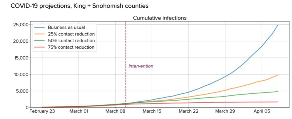
There’s a plot that has been stuck in my brain for about 10 days:
Part of Figure 1. Scenarios for the possible cumulative burden of COVID-19 infection in King and Snohomish counties. (Klein et. al.. 2020)
The plot is based on an infection model that was published by a team of researchers in the Seattle area who projected future Covid-19 cumulative infections for King and Snohomish (I’ll use the term Sno-King) over a four week interval commencing on 11 March. (Klein et. al., 2020) [1] I wanted to understand how our communities are doing in the struggle to slow the rate of new infections.
We do not yet know which scenario best represents current conditions in King and Snohomish counties, but previous experience in the region with weather-related social distancing and in other countries suggests to us that current efforts will likely land between baseline and 25% reduction scenarios.
(Klein et. al., 2020) on 11 March 2020
I believe there’s enough data (as of 25 March 2020) to claim that the Sno-King population has achieved the 25% reduction level due to social distancing. That’s certainly an improvement over two weeks but there’s still more work to be done. I’ll present some results from a very simple model I made and then discuss how I made this model, what its limitations are and suggest some improvements.
In Figure 1 below, the blue curve is a projection using an exponential model of the baseline for new infections for 28 days ending on 7 April 2020. The red curve is a projection of a 25% reduction in infection rate. The intent of these curves was to reproduce the model curves of Klein et. al. Finally, the yellow curves plots the number of cases in Sno-King. The underlying data, model and plots are available on a Google Sheet I created.
Figure 1: Cumulative Covid-19 infections, Exponential model King and Snohomish Counties, updated 25 March 2020
Now, I realize that it’s difficult to see much from this curve. I looked at the change in new daily infections, I believe that’s a better metric to visualize how we are improving. Figure 2 provides this visualization with the yellow data points show the daily increase in new cases compared to the baseline (blue) and 25% reduction (red) lines. I realize that there’s not very much data yet but we are seeing new data being published daily (and I will update this analysis sheet daily). Still, this made me realize that we are likely achieving 25% reduction level due to social distancing in Sno-King!
Figure 2: Daily increase in Covid-19 infections, Exponential model King and Snohomish Counties, updated 25 March 2020
Building the Exponential Model
Since I’m an engineer, the first thing I did was build my own model and then start feeding in data to measure how we are doing.Of course, the devil is in the details, and I’m not an epidemiologist. What I did was reproduce the results of Klein et. al.. 2020 using the facts they provided: a doubling time for the epidemic of 6.2 days, one large transmission cluster, four week duration, and less than 1% (25,000 of the 3 million infected at the end of the four weeks.
Let me explain the simple, deterministic model I used. To follow along, you may find it helpful to look at the underlying Google Sheet I developed. I am including underlying cell references in parentheses. I used an exponential increasing model that starts with 267 infections (cell L2) at day zero. For a time series of 28 days (cells F2:F30), I calculated the total number of infections using a baseline doubling rate parameter of 6.2 days (cell L3). For the entire 28 days, the baseline I calculated was 24,425 cumulative cases (cell G30). For comparison, the multiple simulations performed by Klein et. al. estimated 25,000 cumulative cases. Thus, my baseline model estimate is about 2% lower than Klein et. al.
For the the social distancing intervention representing a 25% reduction, I increased the baseline doubling rate parameter by a factor of 1.25 to 7.8 days (cell L4) For the 25% reduction case, I calculated was 9,899 cumulative cases (cell H30). For comparison, the multiple simulations performed by Klein et. al. estimated 9,700 cumulative cases. Thus, my model estimate is about 2% higher than Klein et. al. in the the 25% reduction case.
Next, I used the graphic “COVID-19 in Washington State” published daily by the Seattle Times to determine the cumulative number of cases in King (C3:C16) and Snohomish (D3:D16) county for each day and then computed the Sno-King total cases (E3:E16). I have included a tab labeled “DataSource” that lists the URL for each day’s data. Some days, the actual case data is suspect, for example, there was disagreement between King County and Washington State regarding cases on 17 March 2020. The cumulative infections are plotted for the baseline, 25% reduction, and actual cases in the chart labeled “Cumul25March”
I computed the first order difference in infections, the change in number of daily infections, for each condition: baseline (cells J3:J16), 25% reduction (cells K3:K16) and actual cases (cells I3:I16). The change in number of daily infections are plotted for the baseline, 25% reduction, and actual cases in the chart labeled “1stDiff25March”
Limitations and Utility of this Model
This is a very simple model of a complex epidemic. I don’t think it will have much validity beyond 7 April 2020. At that point, a more rigorous model that models the underlying epidemic using ordinary differential equations is in order. Also, the underlying parameters will be better understood. Finally, once more than 1% of the Sno-King population is infected, the simple exponential model will become less accurate.
I think this model will be a useful way for people to visualize the impact of social distancing efforts in the short-term. There’s enough data here to say that social distancing is making an impact. Also, in a small way, this simple model and analysis confirms that our current effort will result in 25% reduction due to social distancing. Maybe the next two weeks will show additional improvement?
Thanks to the Seattle Times and Klein et. al. making me think and look at the data. Also, hats are off to all the essential workers in government, grocery stores, pharmacies and the news media for keeping us safe, healthy and informed.
I welcome suggestions for improvement, corrections and any words of wisdom from anyone reading this. Stay safe.
For the last eight years (2012-2019), I’ve been keeping tracking of my daily steps and miles using a pedometer. I realize there are better gadgets to do this: Fitbits, watches, and phones that will do this job with more data and better graphics. I like to “roll my own” and I thought I would write up what I have been doing. I welcome constructive feedback; my goal is to maintain and improve my fitness as I age through data analysis.
I record my mileage data daily and analyze my results weekly, monthly and yearly. Here is a link to my monthly and yearly mileage data in a Google Sheets file. In Table 1, I want to look at my mileage results on a yearly basis; I’ve also included my age. I can see that my mileage increased significantly after 2013, one reason for this is a greater emphasis on hiking and running. I can also see a drop in yearly mileage in 2016; this was due to some medical problems that required surgery, I had some months were I couldn’t exercise very much. In 2017 and 2018 I was training for ultra marathons and had increased my annual mileage. I find having yearly goals, such as races or long distance hikes, motivates me.
Table 1: Yearly Mileage
Year
Miles
Age
2019
3174
61
2018
3387
60
2017
3286
59
2016
2754
58
2015
3117
57
2014
3008
56
2013
2634
55
2012
2470
54
Here’s a summary of the mileage I’ve done month by month. Table 2 provides a monthly view of my mileage.
Table 2: Monthly Mileage
Year
Jan
Feb
Mar
Apr
May
Jun
Jul
Aug
Sep
Oct
Nov
Dec
Year
2019
301
241
289
242
238
250
273
269
276
280
274
242
3174
2018
318
271
315
252
304
315
272
338
229
301
240
232
3387
2017
256
296
298
259
286
295
288
283
214
291
281
240
3286
2016
187
188
193
215
206
225
238
267
267
305
269
194
2754
2015
245
258
260
244
266
281
247
306
255
250
237
269
3117
2014
224
211
239
206
212
253
282
302
265
267
275
273
3008
2013
210
190
208
229
243
238
256
220
221
209
199
211
2634
2012
147
201
184
192
242
238
245
190
200
213
202
214
2470
Mean
236
232
248
230
249
262
263
272
241
264
247
234
2951
For example, in the first three months of 2016 my mileage was lower than usual, these were months when I was recovering from surgery. Looking at the monthly mileage data, a high mileage month for me has been greater than 300 miles. For each month, I have computed the mean monthly mileage. My mileage tends to be lower in the shorter winter and early spring (December through April); the most likely cause is the dreary Pacific Northwest winters I manage to slog through each year. There are some exceptions such as 2018 when I was training for a 100 miler in the winter and 2019 when I spent time in South America during the winter.
Another way I like to view the monthly mileage data is a cumulative view. Table 3 shows the cumulative monthly data over the course of a year.
Table 3: Cumulative Monthly Mileage
Year
Jan
Feb
Mar
Apr
May
Jun
Jul
Aug
Sep
Oct
Nov
Dec
2019
301
542
831
1073
1311
1561
1833
2102
2378
2658
2932
3174
2018
318
589
903
1155
1459
1774
2047
2385
2614
2915
3155
3387
2017
256
553
850
1109
1395
1690
1978
2261
2474
2765
3047
3286
2016
187
375
569
783
989
1214
1452
1719
1986
2291
2560
2754
2015
245
502
762
1006
1272
1553
1800
2106
2362
2612
2849
3117
2014
224
435
674
880
1092
1345
1627
1929
2194
2460
2735
3008
2013
210
400
607
837
1079
1317
1573
1793
2014
2223
2422
2634
2012
147
348
532
724
966
1205
1450
1640
1840
2053
2256
2470
The sum of all the yearly mileage is 23,831 miles over 96 months or 248 miles per month. Now, how does this compare to my goal performance?
In 2014, I decided to set a goal of 3000 miles in a year. A yearly goal of 3000 miles works out to an average of 250 miles per month or 8.22 miles per day. Before that, I had goals but they were haphazard. Here are my monthly goals for each year (adjusted for leap years.
Table 4: Cumulative Goal Monthly Mileage
Year
Jan
Feb
Mar
Apr
May
Jun
Jul
Aug
Sep
Oct
Nov
Dec
2019
255
485
740
986
1241
1488
1743
1997
2244
2499
2745
3000
2018
255
485
740
986
1241
1488
1743
1997
2244
2499
2745
3000
2017
255
485
740
986
1241
1488
1743
1997
2244
2499
2745
3000
2016
255
493
748
995
1249
1496
1751
2006
2252
2507
2754
3009
2015
255
485
740
986
1241
1488
1743
1997
2244
2499
2745
3000
2014
255
485
740
986
1241
1488
1743
1997
2244
2499
2745
3000
2013
255
485
740
986
1241
1488
1743
1997
2244
2499
2745
3000
2012
255
493
748
995
1249
1496
1751
2006
2252
2507
2754
3009
Once I had my goal and actual monthly mileage, I can compute the difference. A negative number indicates that I am less than my goal. Figure 1 shows the cumulative difference from goal over eight years.
Figure 1 shows five trends that are significant to me.
January, 2012 to May, 2014 there is a negative slope: every month my actual monthly mileage was generally less than my goal of 250 miles per month./li>
June, 2014 to December, 2015 the slope is mostly positive; my actual miles were greater than my goal of 250 miles per month.
January to July, 2016 the slope is again negative; this is the period of time when I was recovering from surgery.
mid-2016 until the end of 2018 I have been (mostly) exceeding my goal of 250 miles per month; the slope is positive with a few wintertime plateaus.
For 2019, the slope is still positive but not as steep, I haven’t been traing for ultra marathons; only a trail marathon and lots of hiking
Keeping track of my monthly mileage difference from goal provides me some useful month to month feedback. Of course, I am motivated by numerical metrics; not everyone is. I have discovered there is a quantified self community; that discovery came just a few years ago. I welcome feedback from everyone. It’s good to learn from others!
I find that this feedback, along with yearly specific hiking or running goals such as run a 100 mile race or hike the Appalachian Trail (a 2020 goal) keep me on track and motivated.
In part 2, I will add my daily and weekly hiking and running goals and tracking methods.
Book Review Army of None: Autonomous Weapons and the Future of War by Paul Scharre (reviewed 8 July 2019)
We are witnessing the evolution of autonomous technologies in our world. As in much of technological evolution, military needs drive much of this development. Peter Scharre has done a remarkable job to explain autonomous technologies and how military establishment embrace autonomy: past, present and future. A critical question: “Would a robot know when it is lawful to kill, but wrong?”
Let me jump to Scharre’s conclusion first: “Machines can do many things, but they cannot create meaning. They cannot answer these questions for us. Machines cannot tell us what we value, what choices we should make. The world we are creating is one that will have intelligent machines in it, but it is not for them. It is a world for us.” The author has done a remarkable job to explain what an autonomous world might look like.
Scharre spends considerable time to define and explain autonomy, here’s a cogent summary:
“Autonomy encompasses three distinct concepts: the type of task the machine is performing; the relationship of the human to the machine when performing that task; and the sophistication of the machine’s decision-making when performing the task. This means there are three different dimensions of autonomy. These dimensions are independent, and a machine can be “more autonomous” by increasing the amount of autonomy along any of these spectrums.”
These two quotes summarize some concerns about make autonomous systems fail-safe. (Spoiler alert: it can’t be done…)
“Failures may be unlikely, but over a long enough timeline they are inevitable. Engineers refer to these incidents as “normal accidents” because their occurrence is inevitable, even normal, in complex systems. “Why would autonomous systems be any different?” Borrie asked. The textbook example of a normal accident is the Three Mile Island nuclear power plant meltdown in 1979.”
“In 2017, a group of scientific experts called JASON tasked with studying the implications of AI for the Defense Department came to a similar conclusion. After an exhaustive analysis of the current state of the art in AI, they concluded: [T]he sheer magnitude, millions or billions of parameters (i.e. weights/biases/etc.), which are learned as part of the training of the net . . . makes it impossible to really understand exactly how the network does what it does. Thus the response of the network to all possible inputs is unknowable.”
Here are several passages capturing the future of autnomy. I’m trying to summarize a lot of the author’s work into just a few quotes:
“Artificial general intelligence (AGI) is a hypothetical future AI that would exhibit human-level intelligence across the full range of cognitive tasks. AGI could be applied to solving humanity’s toughest problems, including those that involve nuance, ambiguity, and uncertainty.”
““intelligence explosion.” The concept was first outlined by I. J. Good in 1964: Let an ultraintelligent machine be defined as a machine that can far surpass all the intellectual activities of any man however clever. Since the design of machines is one of these intellectual activities, an ultraintelligent machine could design even better machines; there would then unquestionably be an “intelligence explosion,” and the intelligence of man would be left far behind. Thus the first ultraintelligent machine is the last invention that man need ever make, provided that the machine is docile enough to tell us how to keep it under control.” (This is also known as the Technological Singularity)
“Hybrid human-machine cognitive systems, often called “centaur warfighters” after the classic Greek myth of the half-human, half-horse creature, can leverage the precision and reliability of automation without sacrificing the robustness and flexibility of human intelligence.”
In summary, “Army of None” is well worth reading to gain an understanding of how autonomous technologies impact our world, now and in the future.